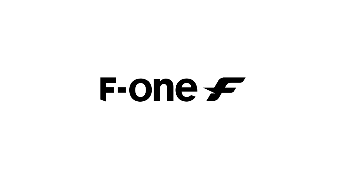
Today we are updating our visual identity in order to communicate our ongoing evolution as a brand.
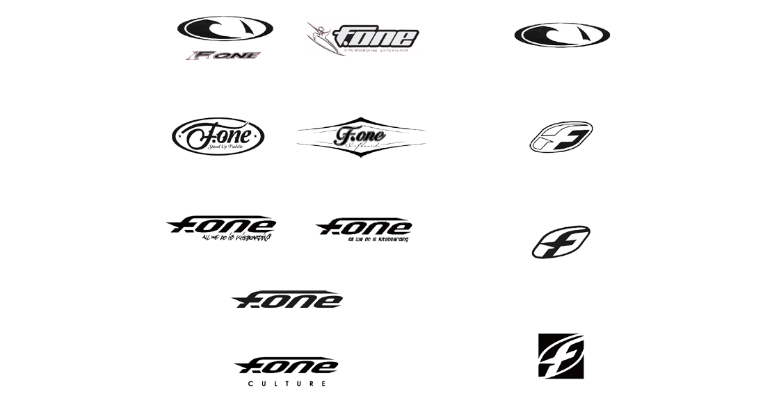
Proud of our rich history and deep roots in the kiteboarding industry, F-ONE has seen already several logo changes at different strategic moments along the way.
From the beginnings of the brand, through to the introduction of the SUP to the range.
The famous « all we do is kiteboarding » tagline had introduced our old logo, which we loved as it is emblematic but does not represent the direction F-ONE is now taking.
We tend to be a brand providing all kind of products for all kind of passions.
F-ONE is now offering more and more ways to enjoy this endless playground that is the ocean, and it was time to a new and more cohesive logo.
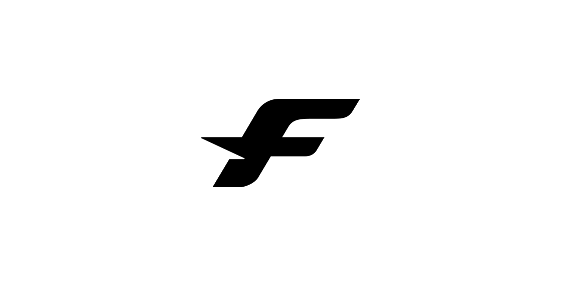
We refreshed the F making it a bit more up to date while keeping the strong identity and making it still easy to recognize.
The logo is consensual and sober, it is unique and has a little French Touch.
While we share this new logo, our vision remains the same.
F-ONE will never stop developing products which will allow to spend as much time on the water as possible.
Check the video release


